The St. Lawrence Foundation is a place for all those social excluded or marginalized, especially people with disabilities, seniors, refugees, migrants and national and ethnic minorities. The foundation’s goal is to provide help and support such as the reintegration of people with disabilities through the promotion of their employment.
Signet design is based on a grid with a square module. Simple shapes are easy to further modification and duplication. The concept based on the act of two people reflects the friendly employer-employee relationship. The color scheme, which does not specify who is who, only emphasizes that everyone is equal.


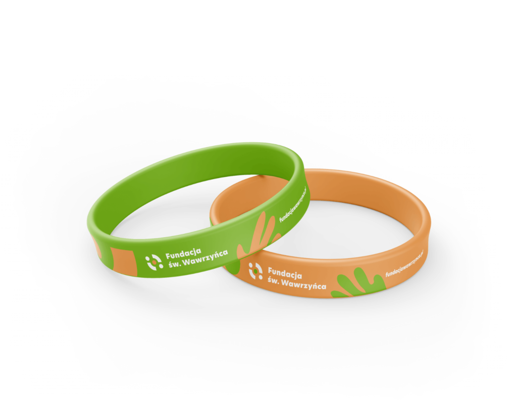
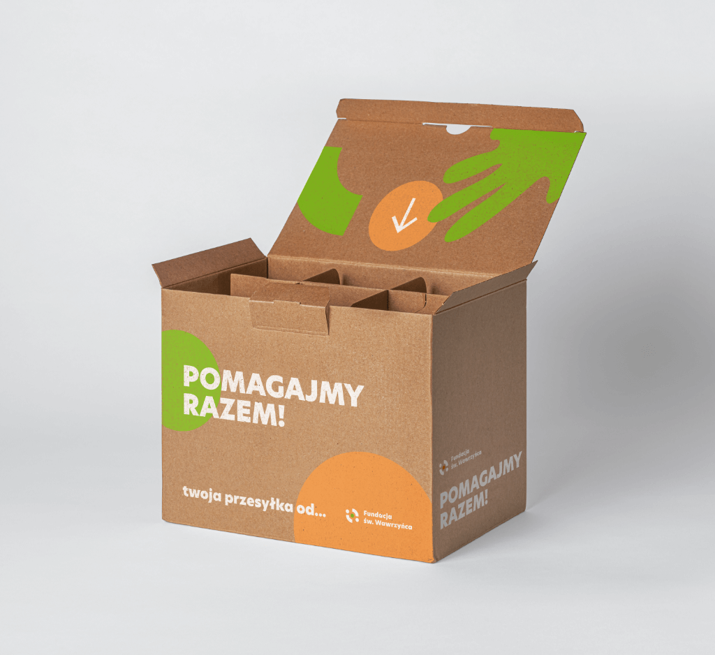
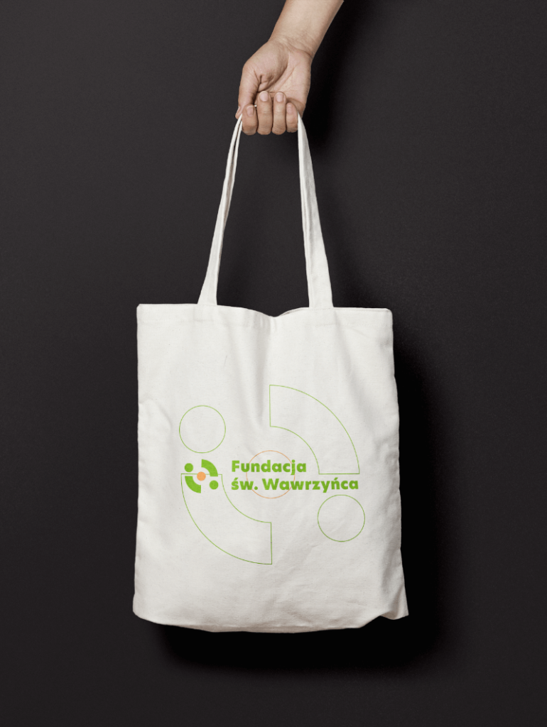
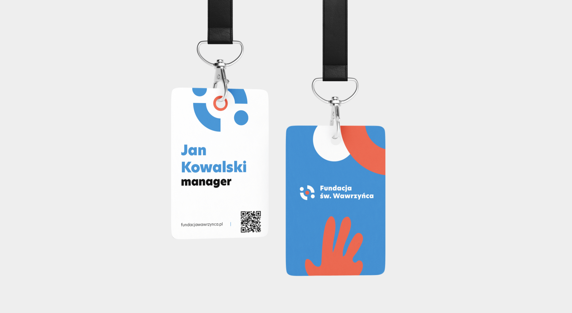
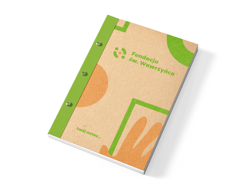
A well-thought-out design concept allowed to create an interesting line of promotional and identification materials for the Foundation.


368 C
242/158/95
2/45/71/0
#F29E5C

Colors are soft and friendly, which give support and emphasize personal and professional development.
With an extensive color palette, the logo can be adjusted to match current events.











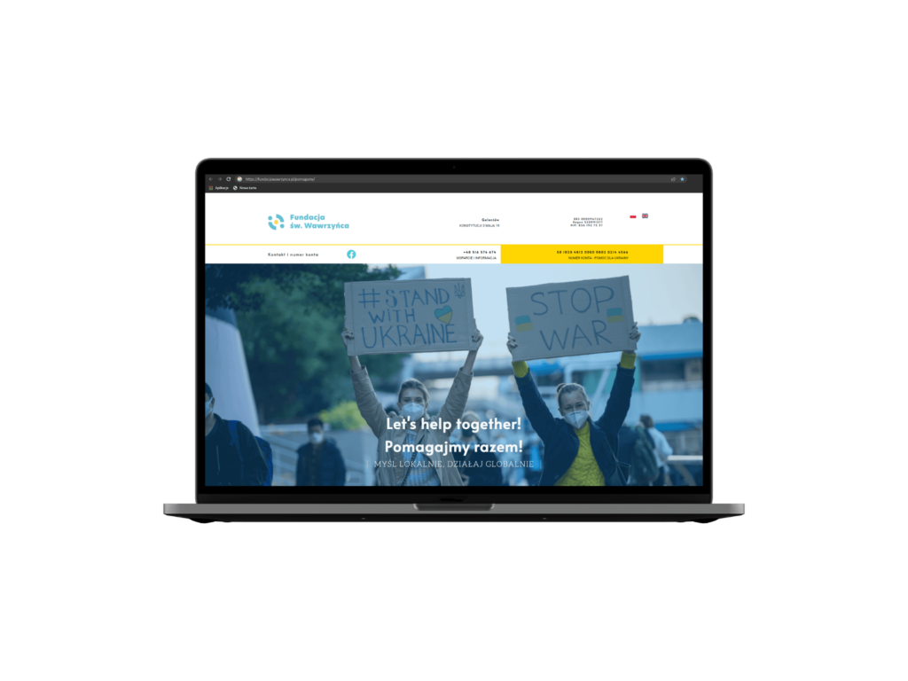
The main idea in creating the current website design
was to clearly present information about the organization and ongoing projects.
